Size: Configure the size of the component by setting width and height. Check the box next to Width or Height to make adjustments.
Different components have limitations when configuring the size.
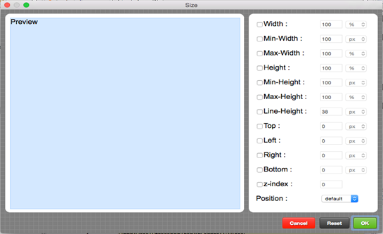 Figure 29 SIZE EDITOR
Margin Editor allows you to set margin to your component.
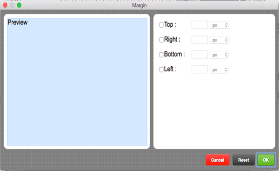 Figure 30 MARGIN EDITOR
Padding : You can set a padding area to a Component. A padding area is an area that takes up space inside the component.
Depending on the component, the allowable padding area varies.
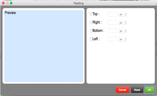 Figure 31 PADDING EDITOR
Font Editor allows you to set font type (style, color, weight) to your preference.
Depending on the component, the allowable padding area varies.
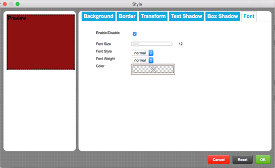 Figure 32 FONT EDITOR
Border Editor allows you to set border around the component. You can set the thickness of the border, as well as edges, border style, border color.
Note that depending on the component, border edges and border style may not be adjusted.
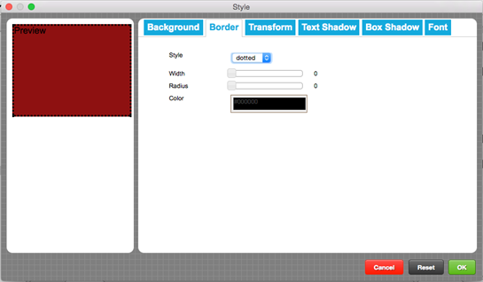 Figure 33 BORDER EDITOR
Background Editor allows you to set background (solid color, gradient color, or image) to the component.
 Figure 34 BACKGROUND EDITOR