When creating an application, you should consider three things-- visual design, logic design, and data configuration.
Visual design, logic design, and data configuration were previously available to only programmers; however, using NEST you are able to access and use these features without having to code like programmers.
Three features NEST offers are Design, WorkFlow, and DataFlow. These features are used to easily set visual design, logic design, and data configuration. Common uses and how to use these features will be explained in the following sections.
- Design
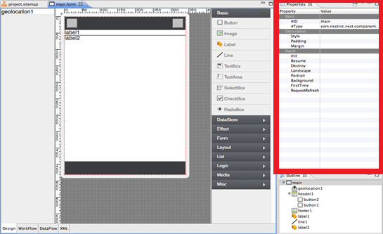
Under the Design tab, you will see the Page Viewer located in the center of the IDE. On the right side, you will Properties, where you can set properties of each Form as well as each Component.
Also, you can set properties to Workflow and DataBinding by setting Event activities under Properties Tool Bar.
The design and event functions of components can be set in its Properties. Design options such as size and style can be set by clicking on the component you wish to customize and from there in its properties click on what you would like to edit. For example to edit the size of the component click on size in the components properties and then click on the small box that appears in its row. Clicking on this small box will open up the options on how to change the size and then choose the desired dimensions from the box. Component Events can also be set also be set here, events are functions the component executes in the application. Events are assigned to components similar to how size and style of components are change. Events are categorized by when they are executed such as “Tap” and “Init”. Tap means the event is executed when the component is tapped on or clicked and Init indicating that it is done at initiation.
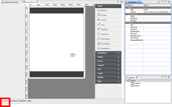 Figure 11 Design Mode in Visual Editor
- Workflow
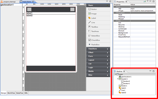
Workflow displays a visual map of application logic activities between Forms and can be accessed by clicking on the second tab next to Design and DataFlow at the bottom of the middle window after opening up a Form. These application logic activities can be set under Event in Properties in Design Mode. Events are the actions the component executes. Workflow window can be used to check if the events assigned to the components are correctly assigned. The comprehensive visual map of all the events and the associated components can be used to quickly check the events and also edit them.
 Figure 12 Workflow in Visual Editor
* Example on how to use Event and Workflow, Each component can be directed to play a specific activity. For example, when you have added a Button Component to your app page, you probably want the button to take you somewhere when pressed on your phone. As shown in Figure 12, you can link 'onTap' of button1 to panel1 'show'. By doing so, when you click the button on your app, it will appear the panel1. Since 'onTap' of button 2 is set to 'hide' on panel1. When you press button 2 on your application, panel1 will hide again.
As stated above, there are two ways to set Events to Components. One way is to set them under Workflow tab by using Links. Another way is to set them under Properties under Design Tab. Workflow events can be set by clicking the Flow tool on the Palette located to the right of the Workflow window. Once the Flow tool is selected click on the component the action on it that you would like to use. Then click on what and how you want that component to act on. These events can be removed from the Workflow window but remember to click on the Select tool then right click and select delete to remove it. Application logic can also be implemented with non-visible components found on the palette (see Figure 13) in the Workflow. The non-visible components can be dragged and dropped onto Workflow where its logic can be directed via Flow.
Let's take a look at Properties located on the right side of IDE under Design tab. Under Event, you can set the activity 'on Tap.' You can set the activity of Components to what you wish to do to the other Component. Workflow window can be used to view if the events for components set with properties is linked to the correct destination.
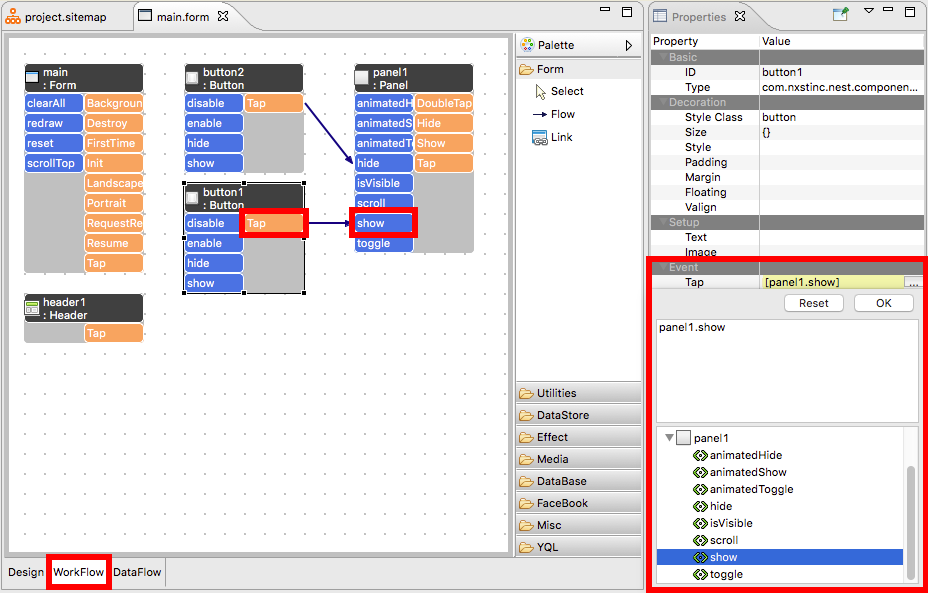 Figure 13 Workflow and Properties Settings
- DataBinding
DataBinding is when data processing components (Database, DataStore, Facebook) is used to transfer data from one component to another. An example being when a navigation component gathers the geolocation of the device and transfers it to a map component to pin point a location. They can be selected and edited on the palettes of both the Design and DataFlow window (see Figure 14). In the DataFlow window the data processing components can be dragged and dropped onto the window where the applications data can be directed via Flow. In the Design window they can be selected the same and direct the applications data through the component properties window.
Databinding can be used and seen on the DataFlow window located on the bottom of the middle window of the NEST Platform. DataStore components must be first selected and edited through its properties window to be assigned its functions under the Event section of the component. The DataStore components used then can be seen in the DataFlow window similar to the WorkFlow window. In the DataFlow window the DataStore components can be edited for its events on when and hot they occur.
 Figure 14 DataFlow in VisualEditor
*DataStore Component will be explained fully later on.
Here, let's go over the basics of DataStore Component and it can be used in DataBinding.
For example,
If you plan on creating a Twitter app or another SNS app, you need to bring the information from Twitter or the other SNS to display it on your app.
To do this, you need to search for the data at Twitter and bring the desired data to the Component to show on your app.
Once you have brought the data to the Component, you need to DataBind the data to either Text Component or ListView Component to display the data.
To configure this type of data, you need to use DataStore Components.
Most commonly used Components are LinkData, FormData, and StringTable.
To bring data from your phone, you may use GeoLocation, LocalStorage, and etc.
To connect to a server, you can use AJAX Component.